What’s Wrong with Food Delivery Apps? A UX Redesign of DoorDash
How I Solved 5 Frustrating UX Problems in DoorDash to Make Food Ordering Seamless
I have made this case study in 2022, so you may find some of the proposed solution in current app
Context
Individuals struggle to find time to cook at home in today's fast-paced culture due to the hustle and bustle. Dining out, which used to be a convenient alternative to cooking, has become more difficult as a result of restaurant limitations imposed to combat the current COVID-19 outbreak. Restaurants are increasingly relying on digital solutions to assist in food delivery.
In this case study, I'll try to identify some of the issues users encounter when ordering food via the popular food delivery app DoorDash. Later, I try to figure out a feasible solution in UI design to overcome certain difficulties.
Understanding the Problems
When I first arrived in the United States from India, around 6 months ago, I got to know about the renowned food delivery app DoorDash. I was quite eager to use it to place a food order over the weekend. However, when I used the app, I was surprised by how many UX issues there were. Despite the numerous challenges, I was forced to use Doordash because several of my favorite restaurants are only featured on that app. After a few months, I decided to work on these problems and find possible solutions.
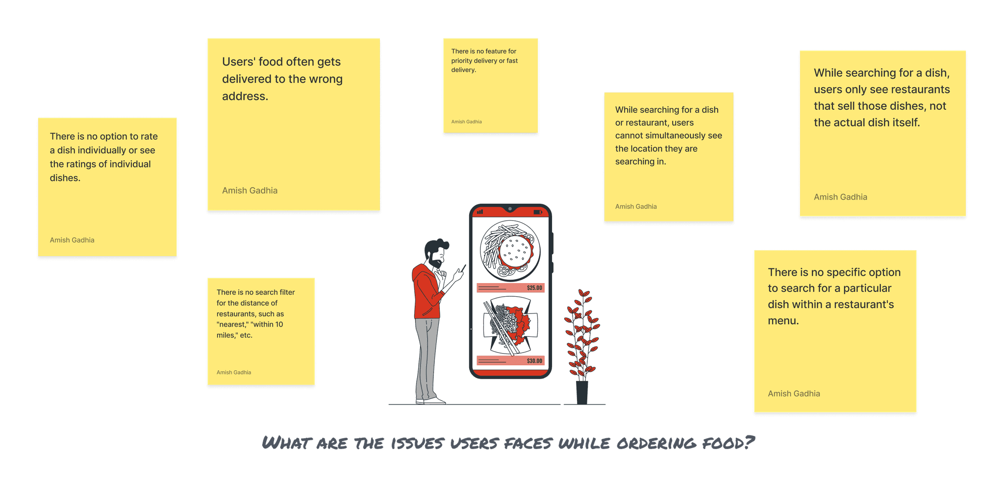
Frequent Wrong Deliveries – Users often receive food at incorrect addresses.
Lack of Individual Dish Ratings – Users cannot rate individual dishes or see dish-specific ratings.
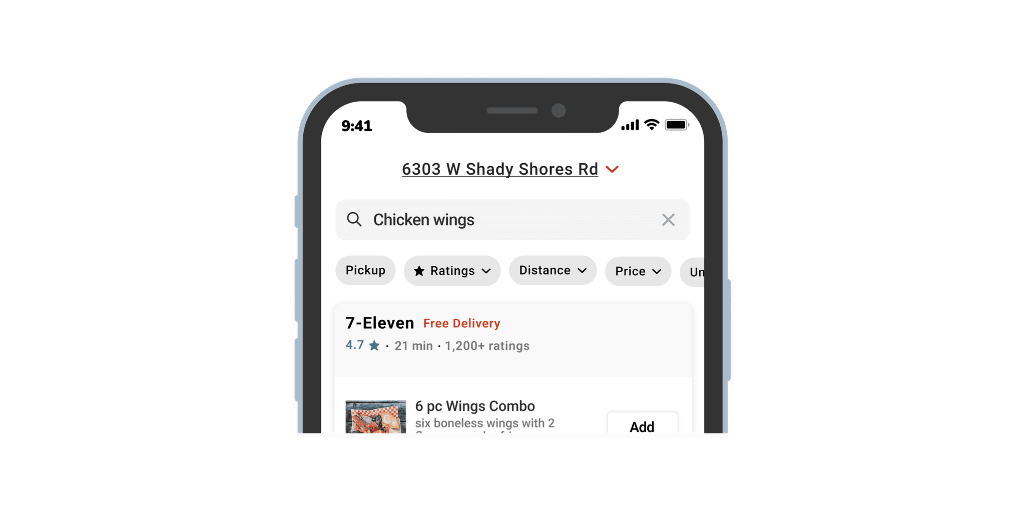
Dish Search Shows Only Restaurants – Searching for a dish only displays restaurants offering it, not the dish itself.
No Parallel Location Visibility – Users cannot check their selected location while searching for dishes or restaurants.
No Distance-Based Search Filter – Users cannot filter restaurants based on distance (e.g., within 10 miles).
User Research
After noting down the issues I'm facing, I decided to do some research on the problems. To have a better understanding of the issues, I decided to interview a few users. The interview's target audience is a DoorDash user who orders food atleast once or twice a month.
I prepared the questions for the semi-structured interview. I keep most of the questions open-ended to understand the user's problem thoroughly.
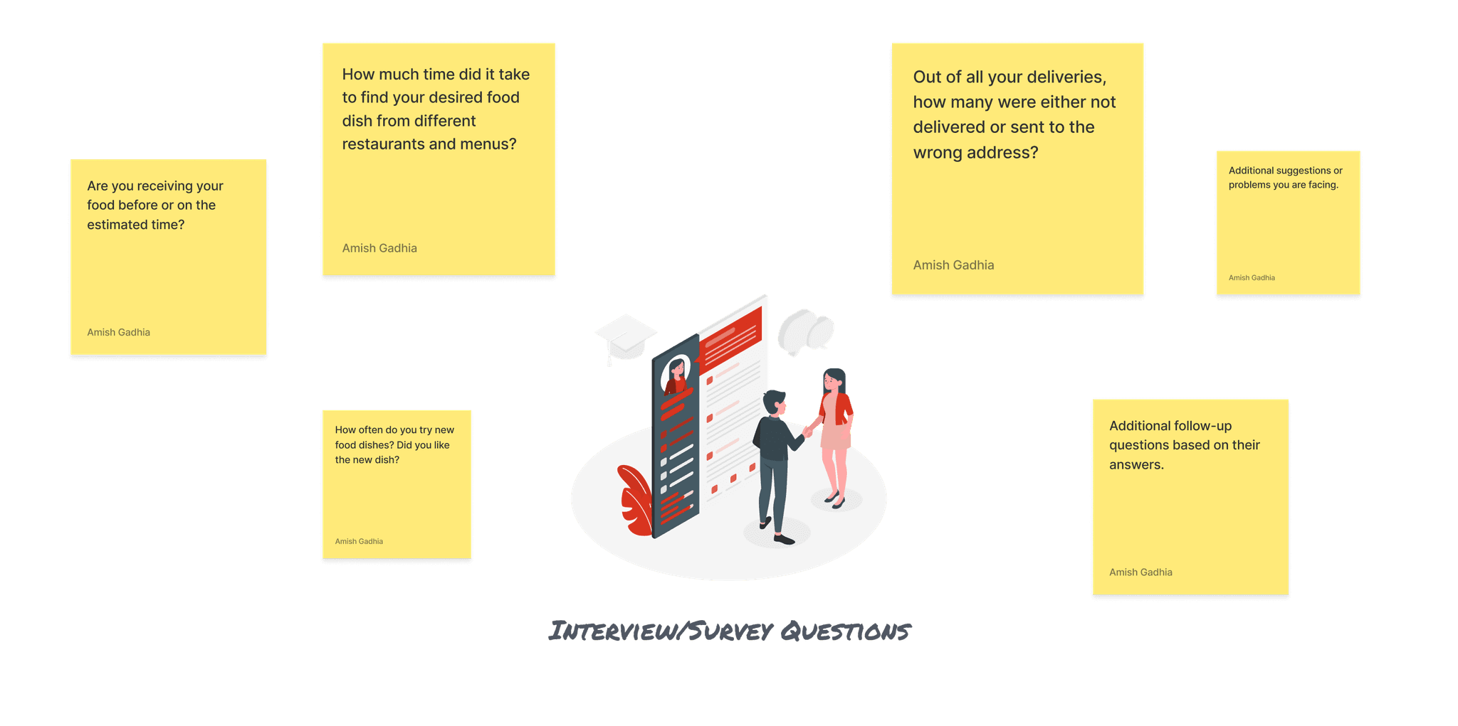
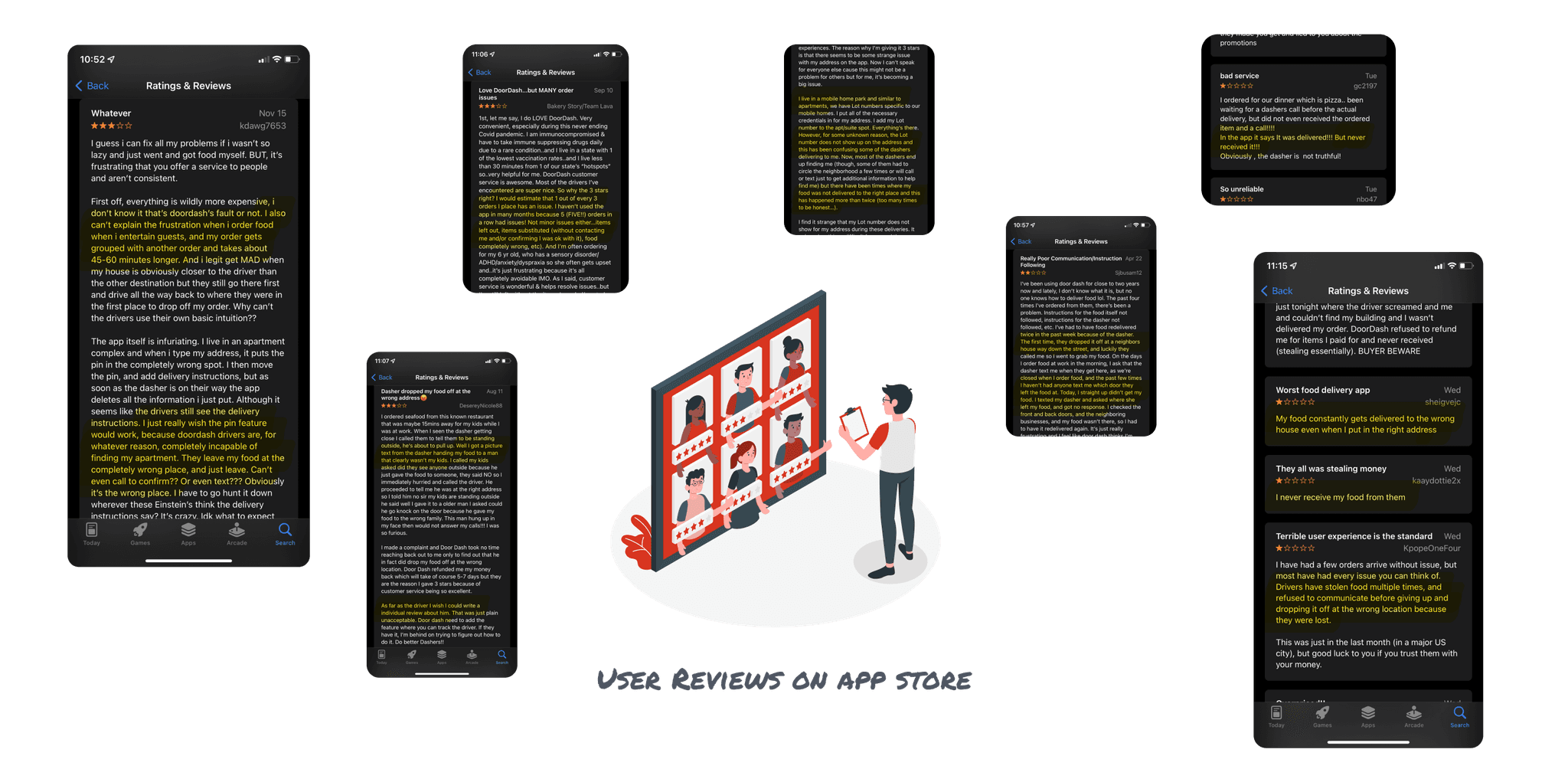
In addition to interviews, I read the reviews of the DoorDash app on the App Store. I highlighted the user's difficulties and pain points.
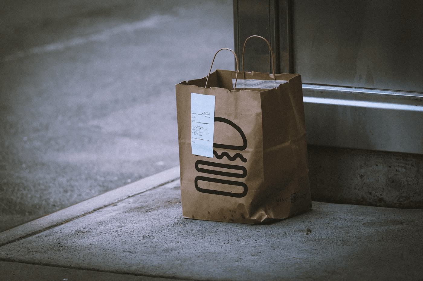
"It said it was delivered! But I never received it."
"There has been confusion where some of the dashers and buildings that look the same and the addresses and building numbers of these homes all collide."
"My food consistently gets delivered to the wrong house even when I put in the right address."
"Drivers have stolen food multiple times, and refused to confirm the location giving cheap excuses of 'whatever the wrong location because of the app we use'."
"I never receive my food from them."
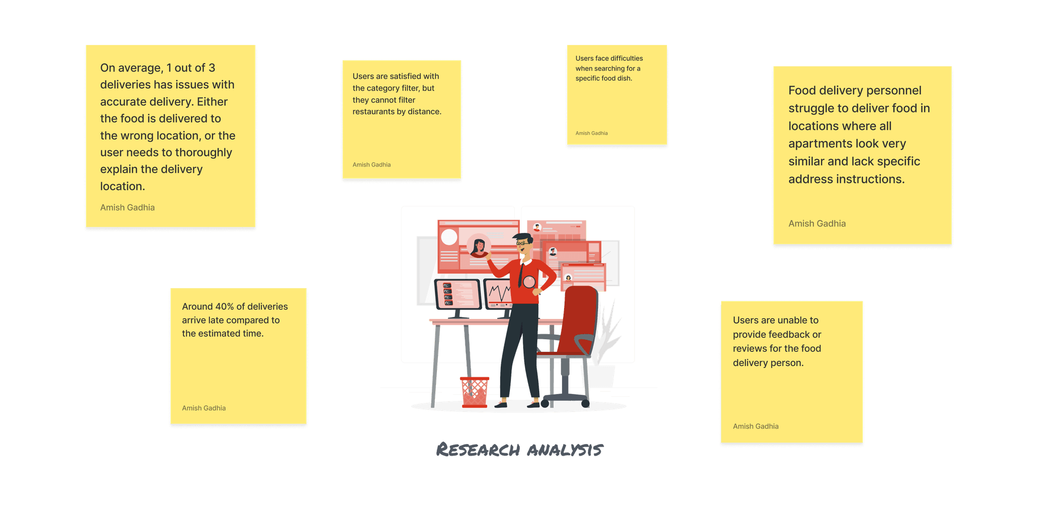
Analysis of Research Findings
I began analyzing the actual issues that the user faces after collecting the user's responses. I used both interview data and App store reviews in my analysis.
Delivery Challenges
1 in 3 deliveries experiences imperfect delivery
Food often delivered to wrong location
Users must extensively explain delivery instructions
Approximately 40% of deliveries are late
User Experience Issues
Difficulty searching for specific food dishes
Unable to filter restaurants by distance
Can't provide direct feedback to delivery personnel
Lack of clarity in apartment/location identification
Proposed Solutions
Food delivery to the wrong location is a common issue raised by users in interviews and app store reviews. The main challenge arises in apartment complexes, where buildings look very similar, making it difficult for delivery drivers to find the correct address.
Delivery drivers often lack clear instructions for drop-off locations and are usually rushed, leading them to leave food at nearby convenient spots rather than taking the time to find the exact delivery point. This results in frustrated customers and unreliable delivery experiences.
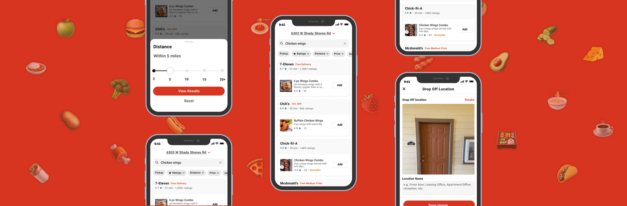
To solve this problem, I decided to add a new feature of uploading an image of drop-off location. With help of this, user can upload picture of their front door, office dropoff location, etc. So that dasher can easily identify the precise location for their delivery drop-off.
DoorDash can also verify the wrong delivery by comparing the user's drop-off location picture and the dasher's delivered location picture.
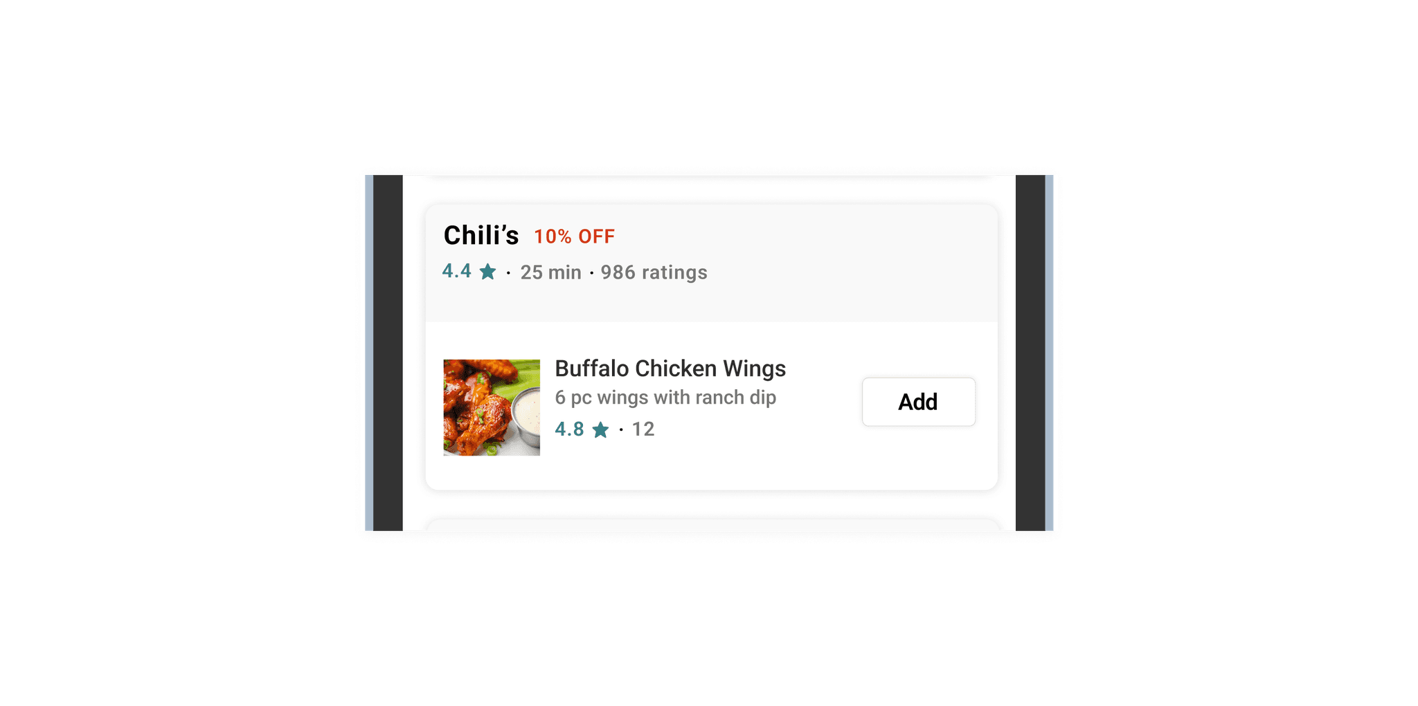
Whenever I search for a dish on DoorDash, it only shows restaurants that sell it, but not where to find it on the menu. I found this frustrating, as users must browse the entire menu to locate the dish. To solve this, I redesigned the search page. Now, when users search for a dish, they see it directly along with restaurant details. If a restaurant offers multiple results, only the most popular or best-selling dish is shown.
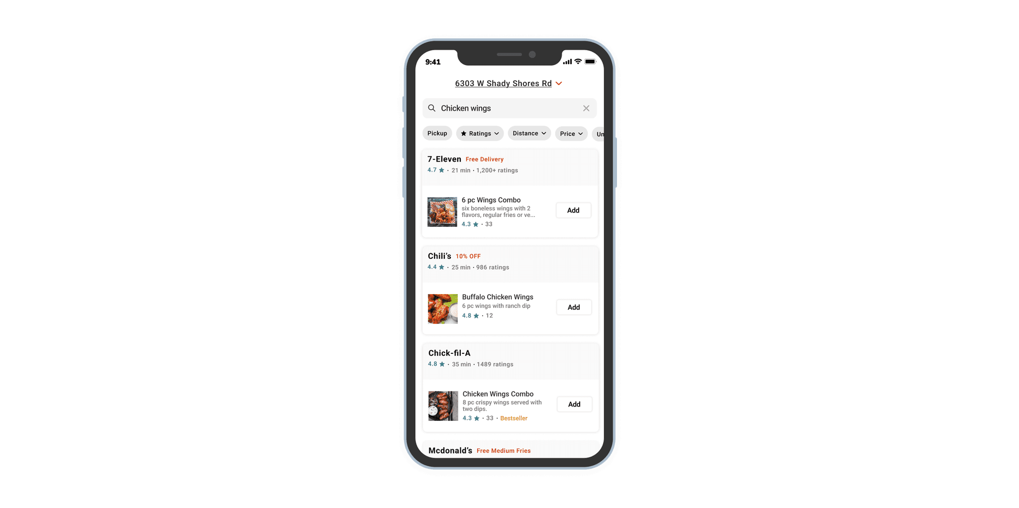
With help of this user can easily search any food dish from multiple restaurants at the same time and they can also quickly add to the cart and checkout without going through the restaurant menu or restaurant page.
Users often order food not just for themselves but for their loved ones as well. However, the search page doesn’t display the selected delivery address. To change it, users must navigate to the home page first. Adding an address indicator with a dropdown on the search page can simplify this process.
When users browse the menu and struggle to choose a dish, ratings can help them decide. To enable this, DoorDash should allow users to rate individual dishes along with the restaurant after delivery. This would provide better clarity for other users.
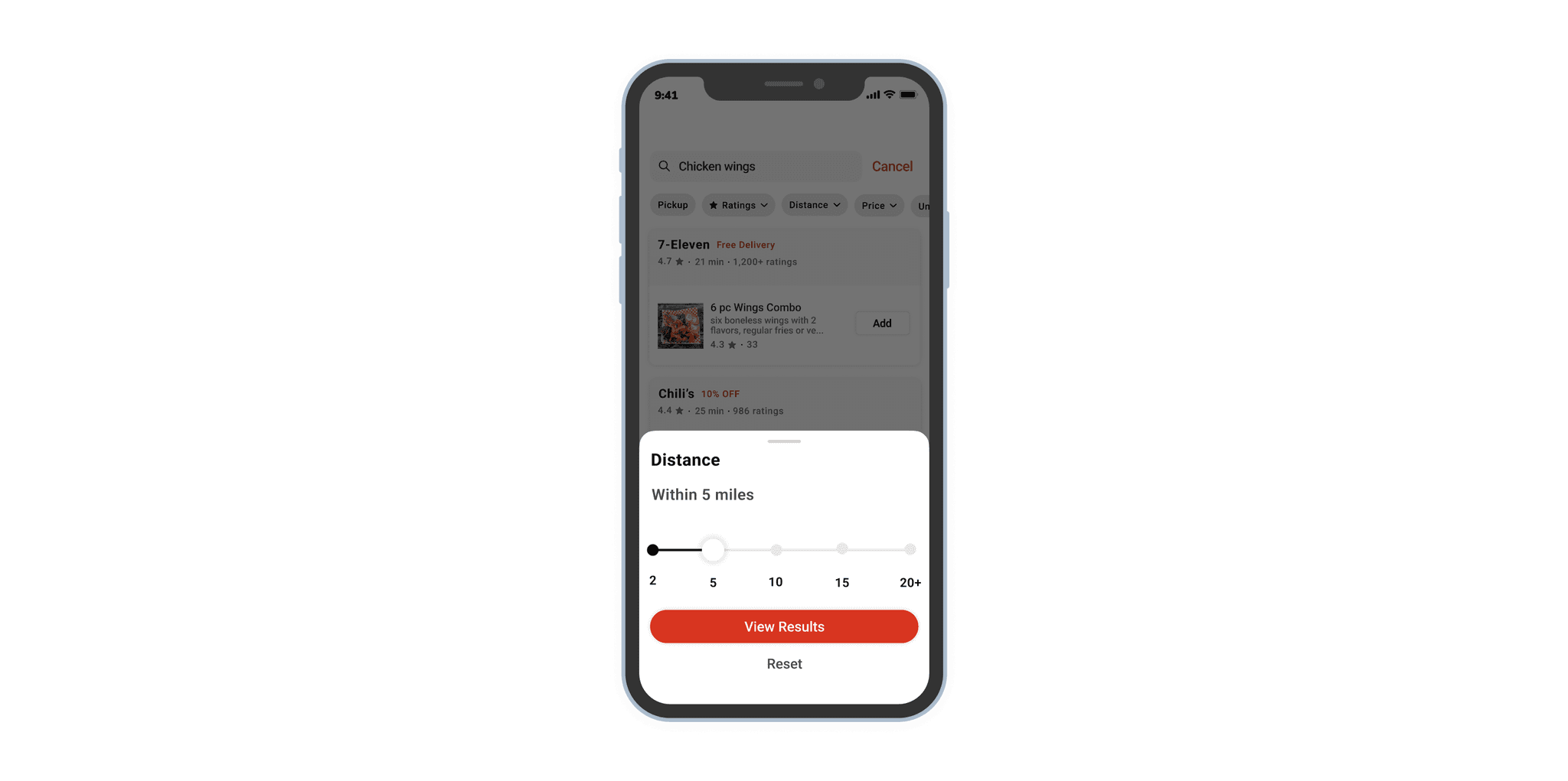
While searching for a dish or restaurant, DoorDash currently doesn't offer a distance filter, making it difficult for users to find nearby restaurants or those within a specific range. To address this, I designed a distance filter on the search screen, allowing users to select the desired mile range from their location.
Takeaways
This case study was both insightful and rewarding. It reinforced several key lessons:
User research is invaluable – Real user insights often reveal pain points we may not have considered.
Small changes can have a big impact – Simple design tweaks, like adding a search filter or rating system, significantly enhance user experience.
Empathy-driven design matters – Understanding the frustrations of users led to solutions that address real-world problems.
By making these UX enhancements, DoorDash can improve customer satisfaction, reduce delivery errors, and provide a smoother, more enjoyable food ordering experience.
This project was a testament to my ability to identify usability challenges, conduct thorough research, and implement user-centric design solutions—skills I look forward to bringing to my next opportunity.
Final Thoughts
Designing solutions for real-world problems is what excites me as a UX designer. Every frustrating user experience presents an opportunity to innovate and improve. I am eager to take on more challenges and create intuitive, user-friendly experiences that drive business growth.