Boosting Online Scheduling from 32% to 68% with UX Redesign
Optimizing the online scheduling flow to enhance patient experience and reduce call center dependency

Context: The Problem
Healthcare should be straightforward, not complicated. Yet patients were actively avoiding our client's online radiology scheduling system, preferring to call the center despite their busy schedules. The existing digital experience was failing both patients and the business:
Patients were frustrated: Complex navigation, redundant data entry, and cognitive overload led to abandonment
The business was struggling: Call center resources were increasingly strained with representatives handling tasks that should be simple online
The numbers told the story: Analytics revealed high drop-off rates within the first few screens, with completion rates decreasing as users progressed
Increase adoption of the online scheduling system.
Reduce call center dependency, optimizing business resources.
Improve accessibility and ease of use, enhancing patient experience.
Boost conversion rates for exam scheduling at imaging centers.
How I Tackled It
Working closely with stakeholders, I mapped the existing user flow and identified critical friction points. Our collaborative analysis revealed a clear opportunity: minimize steps before scheduling while maintaining necessary clinical safety protocols.
Reduce cognitive load at every screen
Leverage existing patient data intelligently
Prioritize the path to scheduling completion

The Redesign Journey
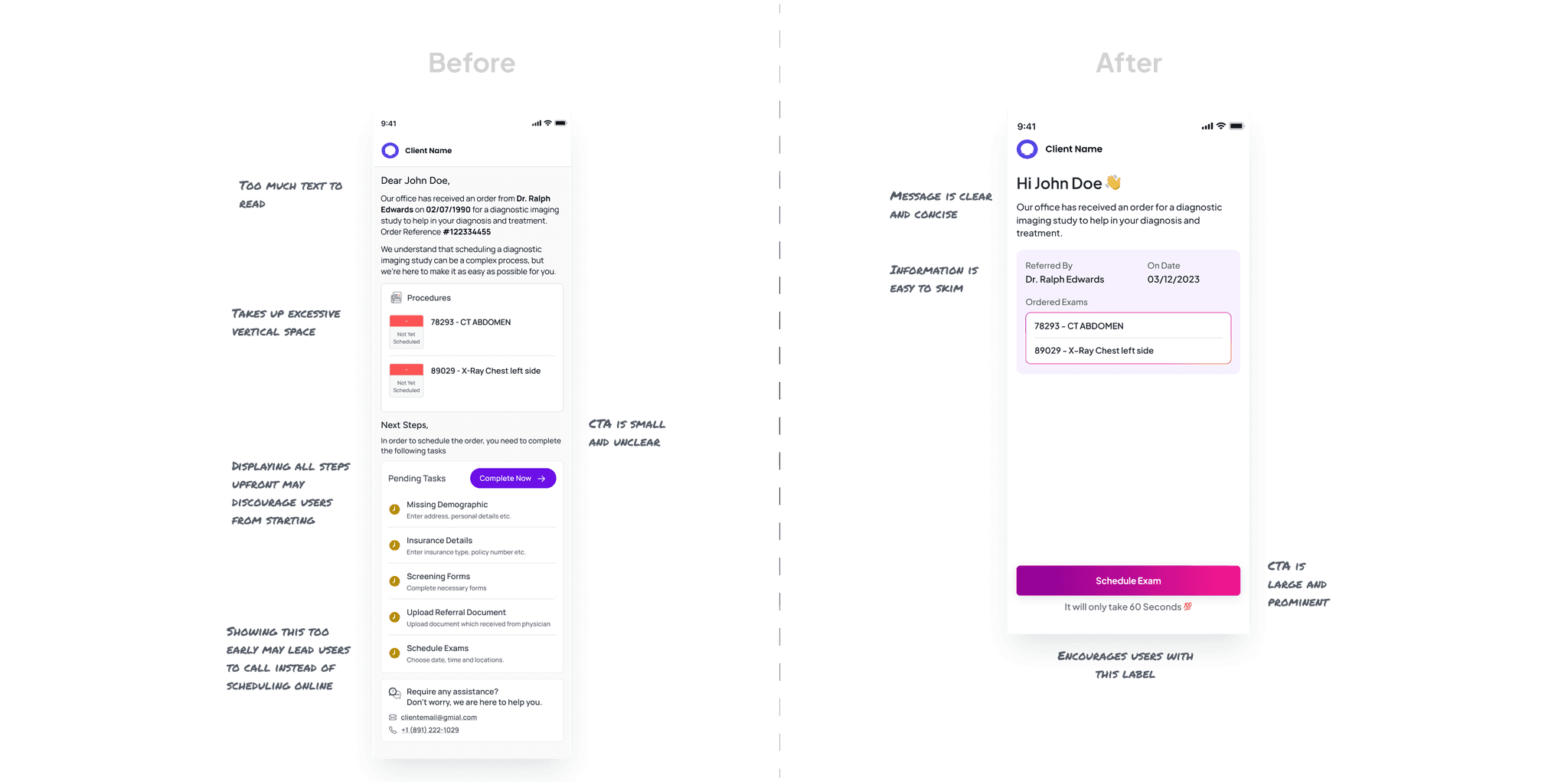
The entry point needed to be inviting rather than intimidating. I:
Simplified the visual hierarchy to emphasize the primary action
Removed unnecessary support contact information that distracted from the main flow
Created clear, action-focused CTAs with supportive microcopy to build confidence
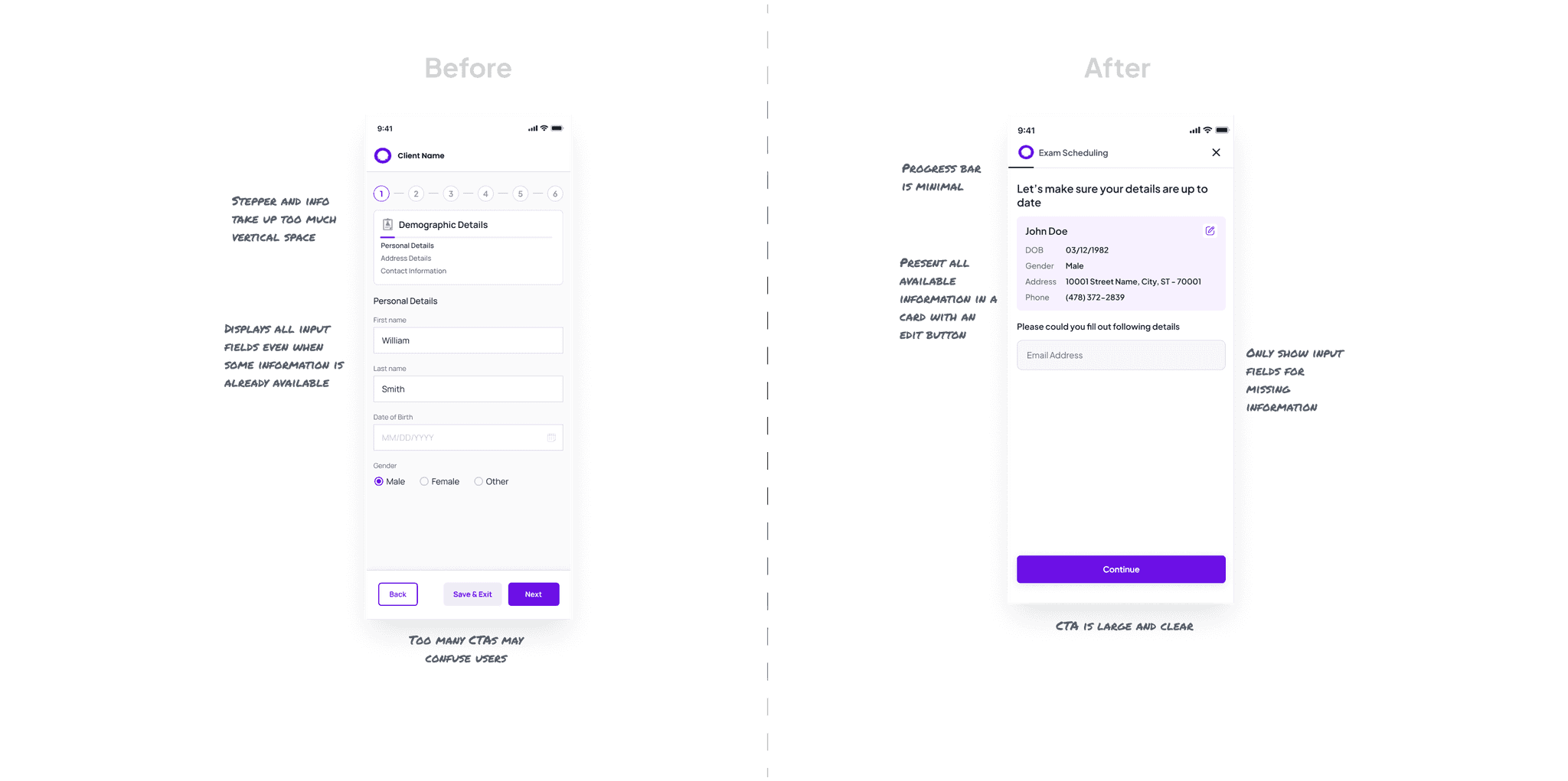
For returning patients, repeating information they've already provided is frustrating. This was especially unnecessary since we already had most patients' information from physician-submitted medical orders. My solution:
Consolidated three separate screens into a single, scannable view
Displayed existing information in editable cards, requiring input only for missing details
Replaced chunky steppers with a streamlined progress bar to maximize mobile screen real estate
Simplified navigation buttons by prioritizing the "Continue" action and leveraging native browser functionality
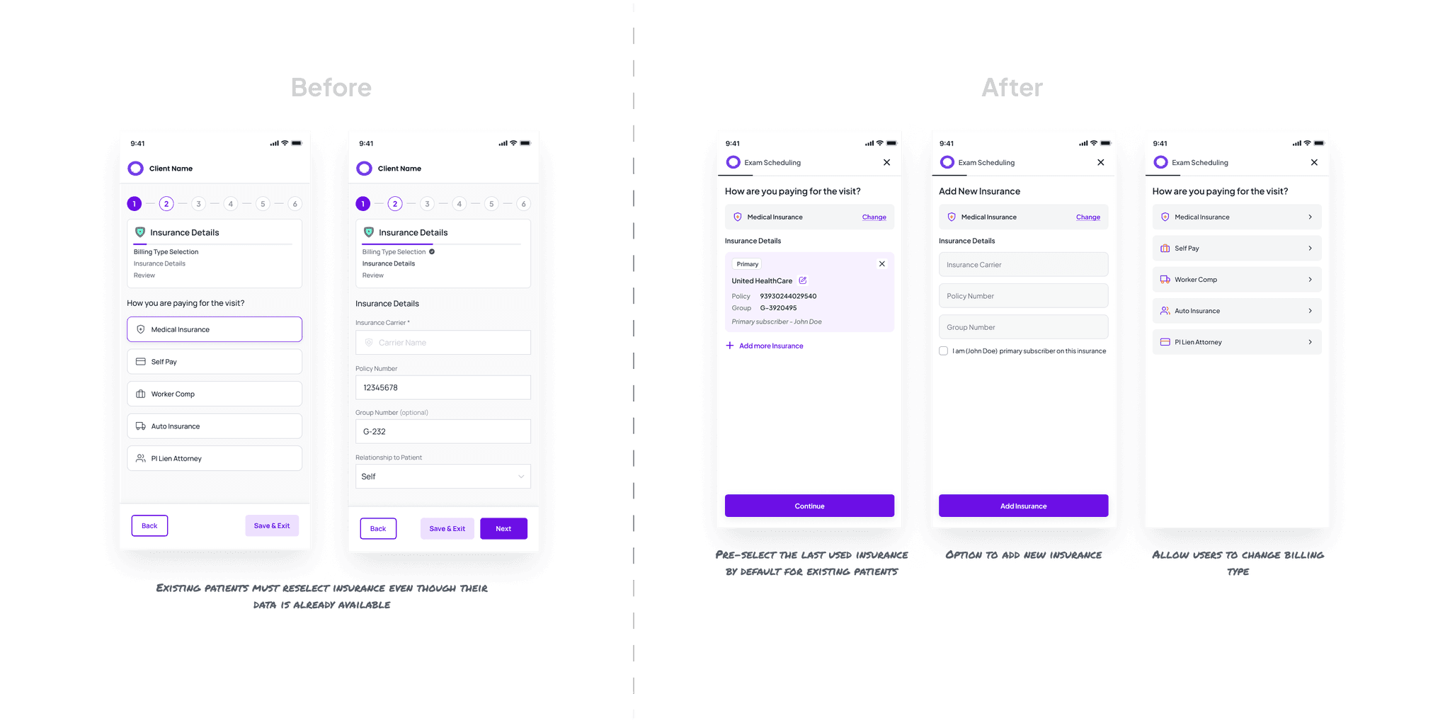
Insurance information entry is typically one of the most abandoned steps. I redesigned this experience to:
Auto-select previously used insurance information where available
Provide clear options to modify or add new insurance details
Allow seamless switching between billing types from any screen
Displayed existing information in editable cards, requiring input only for missing details
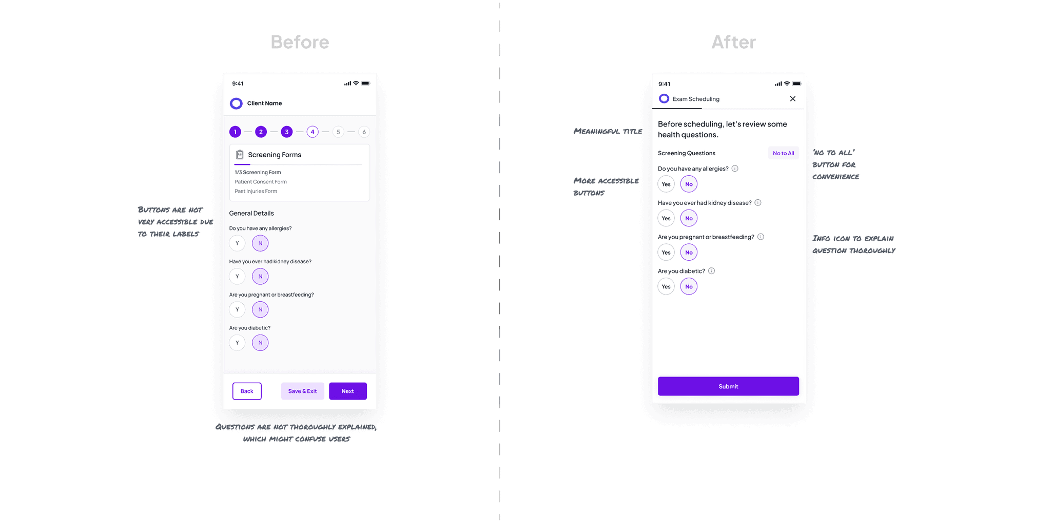
These critical safety questions determine online scheduling eligibility. I enhanced this step by:
Improving question clarity with plain language
Adding contextual help via info icons for immediate clarification
Implementing accessible button labels and interaction patterns
Provide clear options to modify or add new insurance details
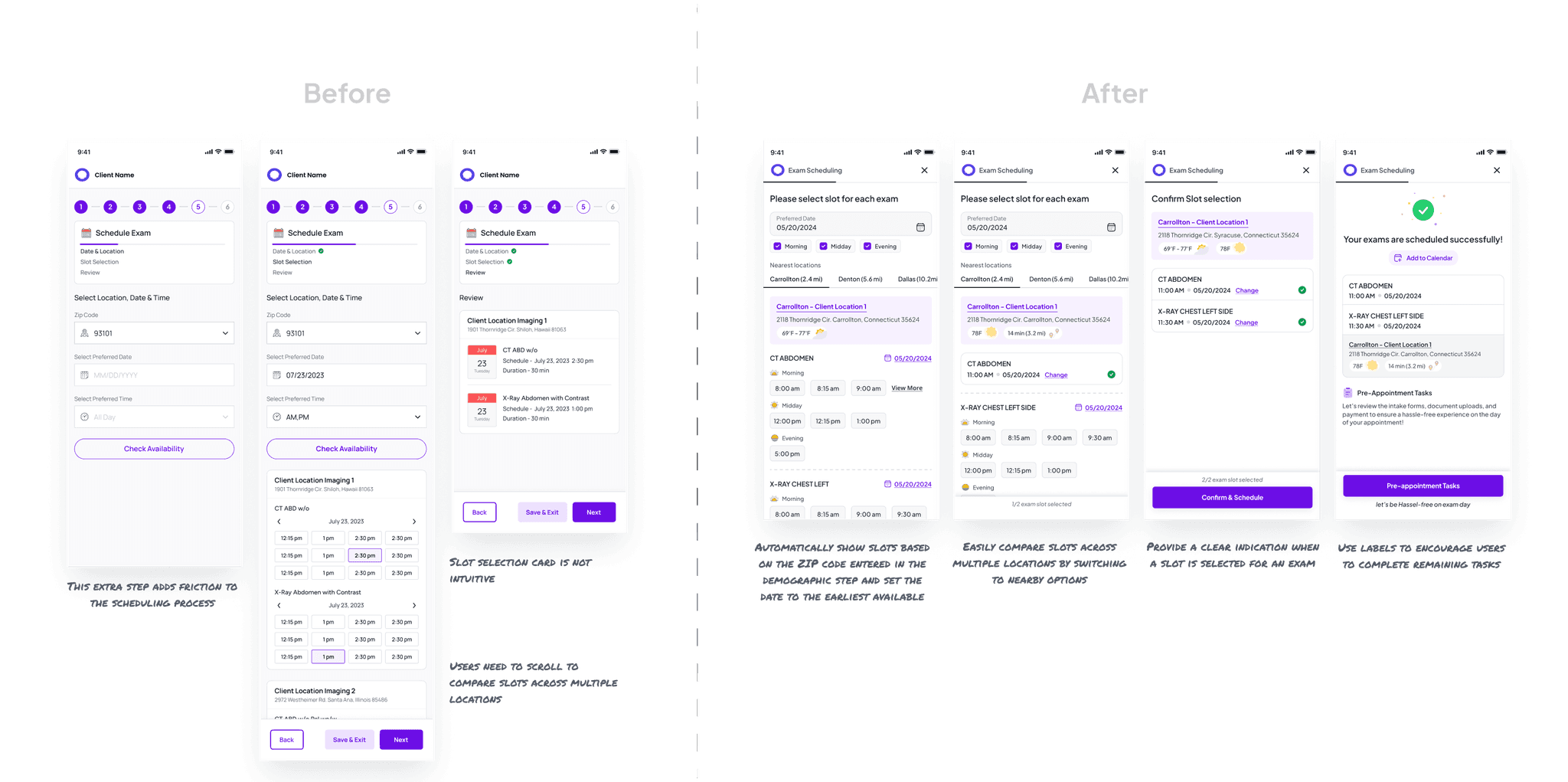
This critical conversion point required special attention. My redesign:
Pre-populated location preferences based on demographic data
Categorized available slots as "morning," "midday," and "evening" for intuitive selection
Added contextual information like weather forecasts and estimated travel times
Created a tab-based interface for comparing appointment options across locations
The payment experience needed to be transparent and efficient. I redesigned it to:
Display payment information above the fold, eliminating unnecessary scrolling
Clearly communicate payment options with smart defaults
Provide detailed breakdowns in layover modals rather than cluttering the main screen
Design a reassuring confirmation experience with clear next steps

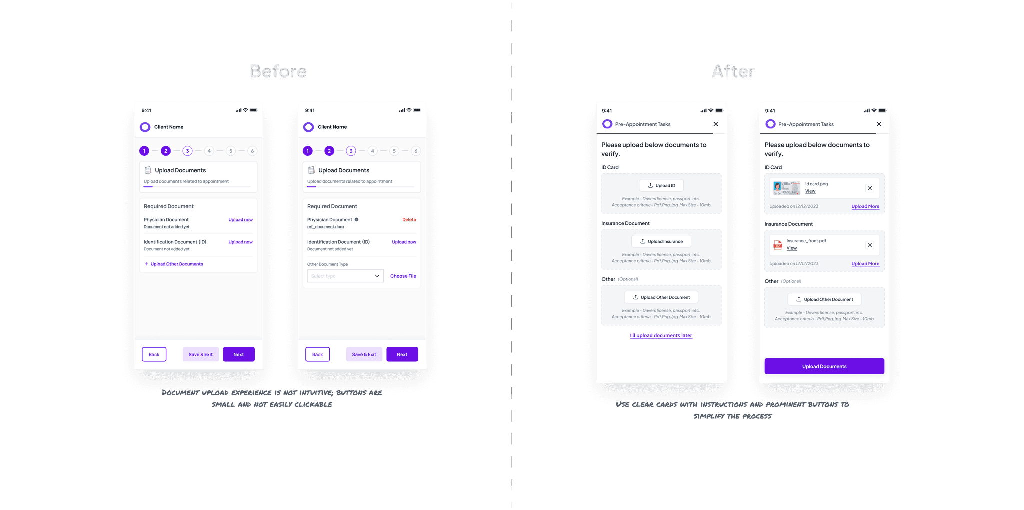
I reimagined this step to increase completion rates by:
Creating dedicated cards for essential documents (ID and insurance cards)
Implementing a visual confirmation system for uploaded documents
Designing intuitive upload controls optimized for mobile devices
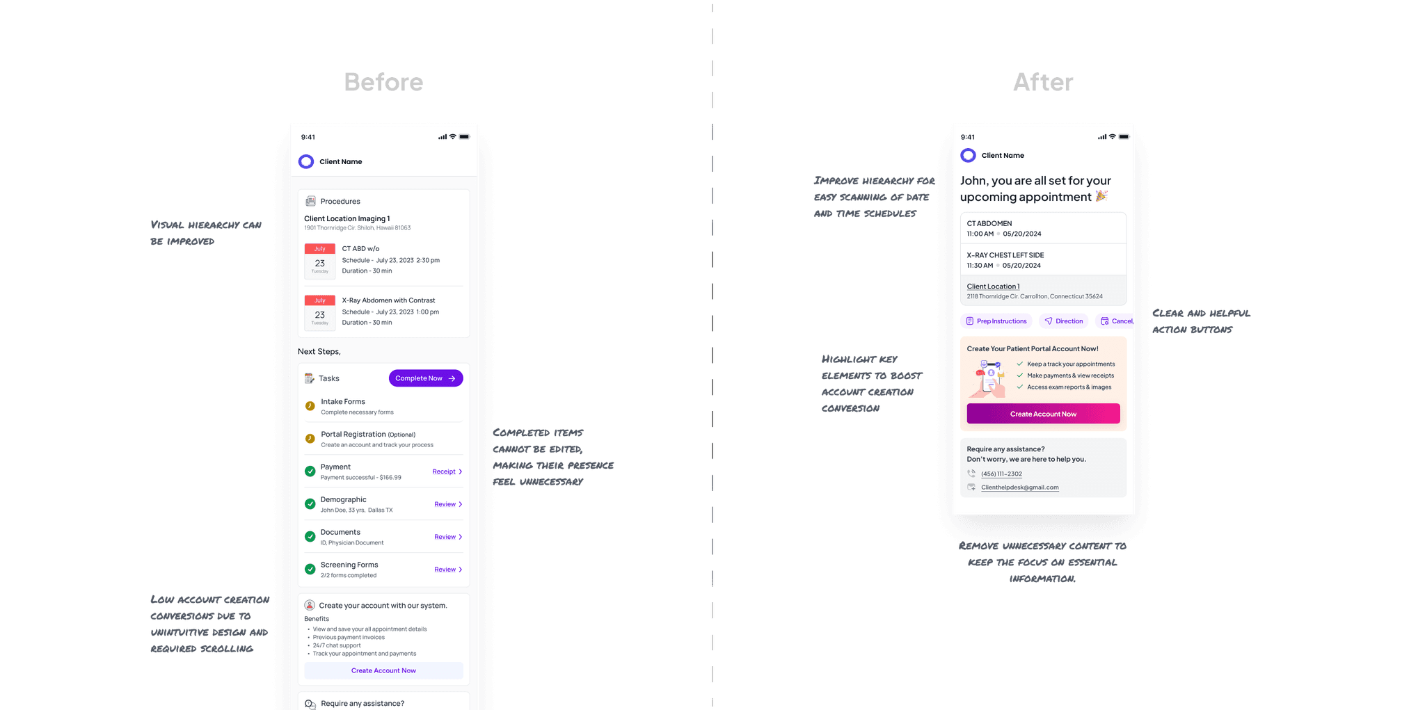
The final screen needed to confirm success while encouraging portal account creation. My approach:
Prioritized appointment confirmation details with clear information hierarchy
Highlighted the benefits of creating a patient portal account
Designed action-oriented buttons for managing appointments
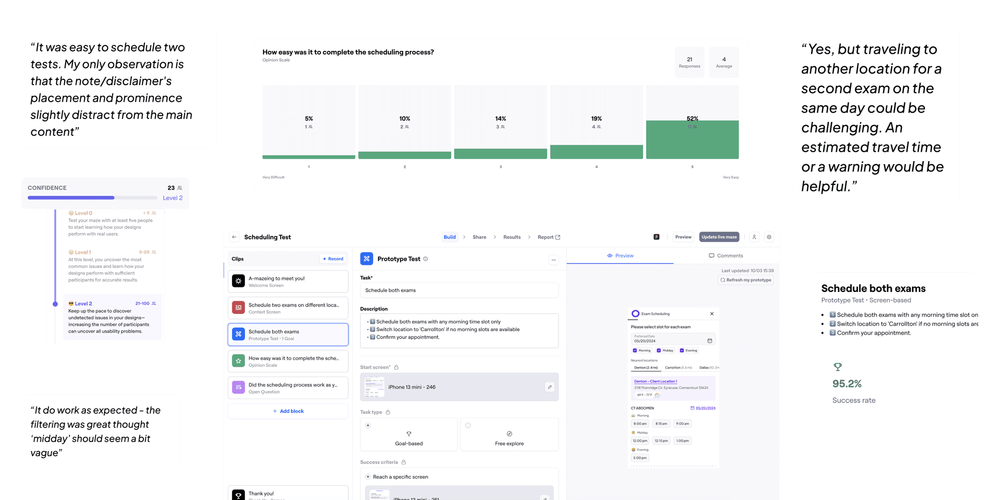
Testing With Real Users
With my computer science background and coding skills, I used Figma’s variable prototyping to create realistic interactions and simulate real-life scenarios.
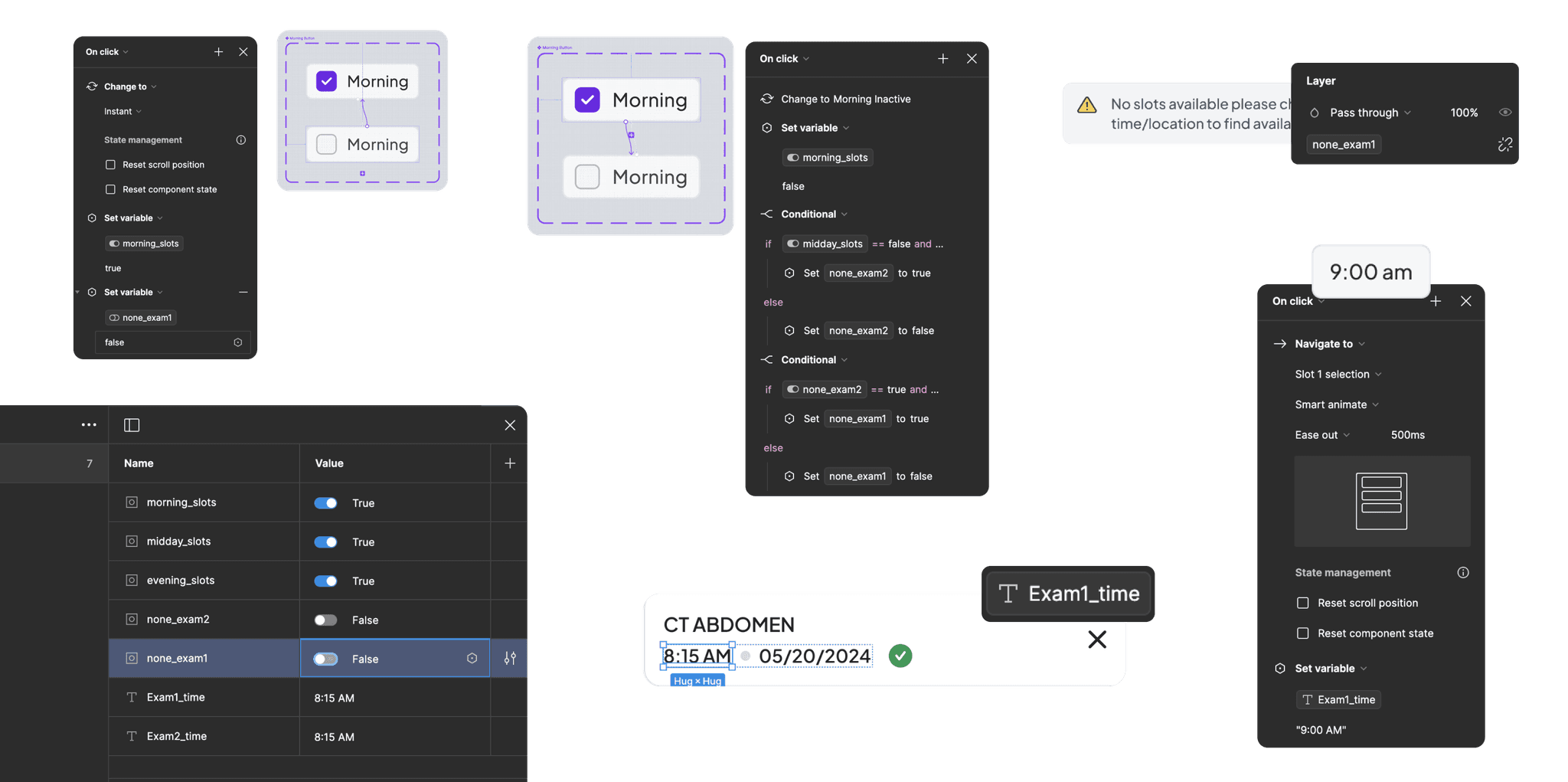
Here is the prototype of the scheduling flow, the core and most important part that I wanted to test and validate.
Created specific testing scenarios to evaluate critical user paths
Utilized Maze for quantitative testing with 20+ participants
Achieved >95% task completion rates with 70% of users rating the experience as "easy"
Incorporated valuable feedback from open-ended responses
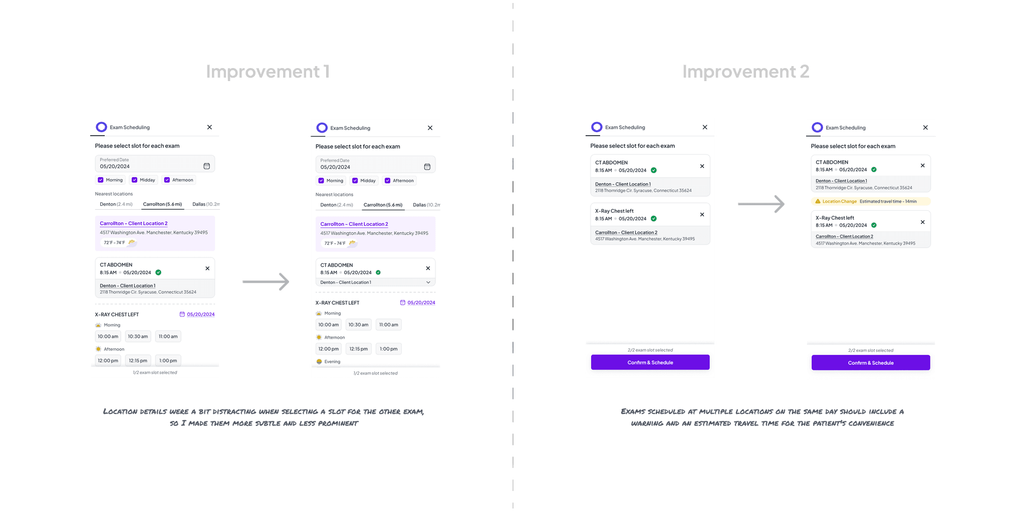
Making It Even Better
Based on testing insights, I made several key improvements before final handoff. Working closely with developers throughout the design process ensured technical feasibility and accurate implementation.
The Results That Matter
68% of patients now scheduling radiology exams online (up from <30%)
Average scheduling time reduced to just 75 seconds
Call center scheduling requests reduced by 42%
Over 150,000 patients positively impacted
What I Learned
This project reinforced several important principles:
Data-informed decision making: Using analytics to identify friction points led to targeted improvements
Cross-functional collaboration: Working closely with stakeholders and developers from day one ensured alignment
User validation: Testing assumptions early prevented potential usability issues
Technical understanding: My background in development helped bridge the gap between design and implementation
The most valuable insight? Sometimes the most impactful design changes are about removing complexity rather than adding features. By focusing relentlessly on the core user task—scheduling an appointment—we created a solution that served both patients and business needs.